021 551 2060

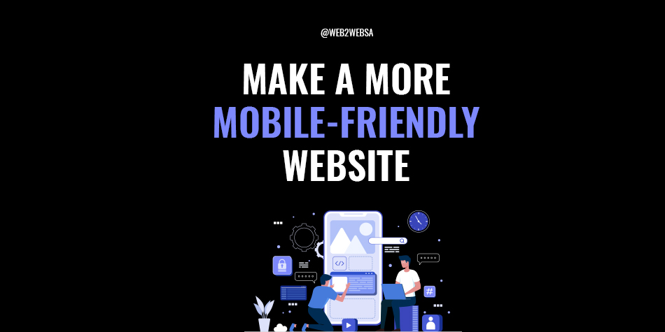
5 tips for a more mobile-friendly website
A mobile-friendly website prioritizes the browsing experience done on phones, tablets and any other mobile devices. Over the last decade, this approach to website design has become vitally important to your company’s online success.
Over 50% of all online traffic comes from mobile devices and due to the ever-evolving technology, this percentage will keep on increasing. It’s not just your audience that will benefit from the quality that comes from mobile-friendly website design, but your search engine optimization (SEO) too. We will get into that and five tips that you can use for a more mobile-friendly website below.
Why use mobile-friendly website design?
As mentioned before, over 50% of online browsing is happening from a mobile device. With this data, we would bet that many of your clients and readers are experiencing your website from their phones or tablets.
This is why optimizing the mobile browsing experience has been at the top of designer’s and developer’s best practice list for years. By adding simplicity and ease of use from the very beginning, you are making your website an enjoyable experience to browse. Companies that don’t do this can experience a huge bounce rate on their website and lose a lot of potential business.
You don’t have to sacrifice your desktop website for mobile-friendliness. With responsive design and mobile versions of your website, you can still have the same great user experience (UX) on desktop. If anything, being mobile-friendly will help your desktop traffic. Search engines like Google rank website’s that cater to mobile users higher than ones that don’t.
Five mobile-friendly website tips.
- Recommended size dimensions.
- Minimize your menu.
- Optimize for portrait mode.
- Limit forms and text input.
- Thumb-friendly design.
Recommended size dimensions.
When designing mobile-first, you need to consider the size constraints from the beginning of the design process. This will help avoid any layout and spacing problems that could pop up later on.
Mobile screens come in a variety of sizes which makes considering size restraints quite difficult. Thanks to responsive design, that won’t be as big on an issue as your website will adjust depending on the size of the screen. When considering how things look on mobile, going by the size of 360 x 640 is the general rule of thumb.
Images can be as wide as necessary, but keep in mind that landscape images will get smaller a lot quicker than portrait. When it comes to considering image size, remember that you don’t have to put the whole image on the mobile screen. Zoom in and crop out extra background details that are not necessary for your clients.
The smaller a screen gets, the more difficult the font gets to read. We recommend not going any lower than 16px for font size on a mobile-friendly website. For more help on how to use font for your website, take a look at this article: How to use typography to improve your website.
The last thing to consider for sizes is buttons. These are extremely important to get right for your mobile website because when they get too small, they become impossible for mobile users to use accurately. Keep button size between 42px and 72px.
Minimize your menu.
Navigation is a big consideration for mobile-first design. It has become standard practice to minimise menus all in one simple hamburger icon.
This symbol has become the internet standard, so your clients won’t get confused when they look for the menu. This can be used to reduce the whole website header into one space that is easy to find and click on. It would be best that the menu then sits over the whole screen with a clear way to close it again.
For very complicated menus that have options inside of options, it is best to use submenus. For the most effective submenu, it is best that the new menu replaces the older menu with a clear way to go back to the previous menu.
If this clutters your menu too much or your website contains loads of information, a search icon can help your readers easily navigate to exactly what they want.
Optimize for portrait mode.
While most mobile devices can be rotated and used in portrait mode, almost all users will browse your website in portrait mode. Think about it, how often do you use your phone in landscape mode? (Not including YouTube).
But this is not a problem. Portrait mode is perfect for single-column layouts. Have each of your elements placed one after each other from top to bottom. You can even break the monotony of centre aligned content by changing between left and right justification.
More ways to create a more appealing single-column can be to use a grid of icons or a photo carousel. The latter can even switch the way users are swiping to keep their attention. Remember to not tightly pack this content and use plenty of white space to create a better UX.
Limit forms and text input.
How many times have you felt frustrated when filling out a form on your phone? It’s too often for us. By minimising forms to their bare essentials, you will avoid a lot of this frustration.
Using auto-fill tools that help narrow down an address or provide email suffixes can take even more frustration out of the mobile experience. Chances are, your desktop users will really enjoy these features too.
When it comes to payment options for online stores, providing several third party payment methods can really help simplify the purchasing process, especially if you are using a favourite amongst your clients. It really helps to remove both finding and carefully typing in credit card details.
Be thumb-friendly.
We use our thumbs for almost all of the mobile experience (scrolling, clicking, typing). Because of this, mobile-friendly design needs to be thumb-friendly. The thumb is one of the shortest and the widest digit on our hands limiting the reach and precision.
It’s for this reason that many designers will make important buttons and other interactable elements as large as they can. In order to make these elements more reachable, many designers will also change the position of the navigation bar to the bottom of the screen. This stops readers from needing to readjust their hand to use these elements and instead get to them quicker and with more comfort.
Make your website mobile-friendly with Web2Web.
Making your company’s website mobile-friendly is essential for online success and Web2Web can help you get there. Our highly skilled team of website designers and developers create for mobile-first and update your current website to be mobile-friendly.
Don’t wait to put your brand online or let your website chase away mobile clients. Get in touch with us and let’s set your company up for digital success.