021 551 2060

6 essential UI design tips
Your business website is an interface that your clients will interact with to buy your products and in this article, we will cover 6 essential UI design tips to make that experience even better.
The user interface (UI) is a combination of all the different elements that communicate with your client on your website. This includes everything that they can see from the moment the page loads. It’s your job to make sure that this interaction creates the best experience possible so that the client not only enjoys being on your website but never feels frustrated. Get this right and your bounce rate will decrease which will lead to an increase in conversions.
The difference between UX and UI design tips.
In a previous article, we covered six steps to improve your website’s user experience (UX). So, what makes this article so important then?
UX and UI are two separate design elements that need to work together for a successful website. That is why there is a lot of overlapping information about these two topics that can create some confusion. To avoid this confusion during these UI design tips, here are brief descriptions of each:
UX is all about user-first design and will cover everything about your website from the moment a client is introduced to it. Through UX, we define the way a client feels when engaging with the website and work on ways to make that feeling better.
UI is on the other side of the coin and true to its name, it’s about the interface design. This will define how your websites interface looks, feels and interacts with your clients. It’s a tool that aids the overall UX of your website that guides the client with icons, buttons, typography, colour, spacing and so much more.
Now that we have defined the difference between these two design elements, let’s start making your UI better with these six essential UI design tips.
Define how your interface is used.
Before we even begin to design the UI, we need to define how people will be using it. This starts with research on the demographics of your clients. The devices they use to browse the internet and how tech-savvy they are will all play a role in deciding how your client will interact with the UI.
Here is a list of the most common ways a client can interact with a websites UI:
- Tapping or clicking
- Dragging and dropping
- Swiping
- Typing
- Talking
Choose the functionality that best suits your clients. Remember to make sure that whatever functionality you use is easy for both desktop and mobile browsers.

Show how the interface is used.
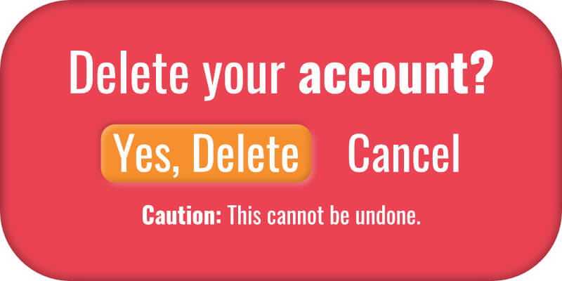
Now that we have defined how it will be used, we need to show this to our clients. The moment they have to figure out what to do means waisted time to them and will lead to frustration. In addition, one click or tap could lead to serious results for the client like spending money or deleting their account. When it’s not explicitly clear on what they need to do, clients can get nervous to interact.
Our goal with UI is to remove frustration and fear and replace it with confidence. By making use of several design elements, we can make the intent of the UI clear to the client.
Here are four things you can add to your UI to help your clients understand what they need to do:
- Highlighting the desired action.
- Using widely understood symbols.
- Clear and directional copy.
- Picking strong colours that correspond to the action.
Anticipate and make space for mistakes.
Let’s face it, someone is going to make a mistake or get lost at some point while browsing your website. If you leave the solution making to after these issues occur, you will be losing many potential clients on your business website. This is why it is vital to anticipate mistakes and provide ways to fix them before they even happen.
If you have ever bought anything online or filled out personal information for an online account, you will see some of the best UI examples for anticipating mistakes. Forms can detect incorrectly entered emails and don’t allow you to submit the form without completing it. Online shopping carts will also have pop-ups to confirm deletion or when there’s an attempt to close the page.
To properly solve this part of the UI, we need to brainstorm every page and answer these questions:
- What is my client doing on this page?
- What can they do incorrectly?
- How can we inform the client on what to do?
Copy plays a vital role here as words are often the fastest way to explain a situation. If your client is deleting something, use warnings if they can’t recover it. If your client is making filled in a form incorrectly, clearly point out what went wrong. It doesn’t hurt to put some of your brand personality into these warnings either.
The art of leaving breadcrumbs.
One of the most common issues a client may have on a website is getting lost. This can be an incredibly frustrating issue and it can happen for several reasons. Whatever the reason is, it’s important to have a way for your client to navigate where they are if your website has many pages to follow.
This is where breadcrumbs come in. They are a simple navigation bar that shows the pages your client went through to get to where they are right now.
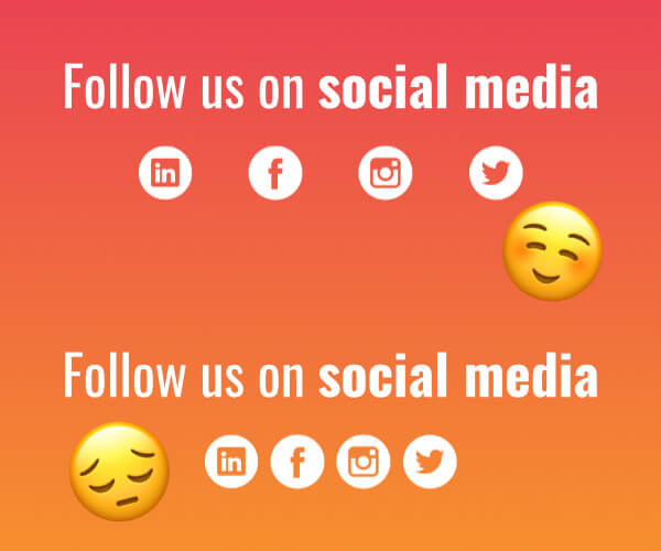
White space is your friend.
If you have space, use it. If you don’t have space, make it. White space allows your design to breathe and helps your websites UX. Not only will the design look more polished, but it will be easier to navigate.
When UI elements are placed too closely together, misclicking and mistakes from the client’s behalf will increase. So do your design and your clients a favour and give the UI the space it needs to be effective.
Provide instant feedback.
When you flip a switch, you expect a light to turn on. When you turn your car key, you expect the motor to start running. Every day we receive instant feedback from the actions we take and there should be no exception when it comes to UI design.
When a website’s UI doesn’t respond to a client’s actions, they will wonder if they should restart or give up. Fortunately, there are very simple ways in which we can give this feedback even if a page still needs to load. This can come in the form of a button reacting when being clicked or a loading screen when the page needs time to load.
The way your UI elements respond should link directly to the decisions made in step one.
Bonus tip: If the page will load in less than 5 seconds, don’t use a progress bar for your load screen. This will make the time waiting seem longer because we are used to progress bars showing with big tasks.
Make decisions simple.
The more UI elements your client sees, the more difficult it becomes for them to make a decision. This is especially true when it comes to making a purchase. This means you should KISS. Keep It Simple, Stupid.
Use as few UI elements as possible, stick to one call to action (CTA) per page and make the space required to move from one UI element to the other minimal.
That being said, you may have pages where you need your client to slow down and consider their options. An example of where you might want this is your company’s blog or when there is a very important decision that needs to be made. In this case, giving your clients more options and long-form content can be desired.
Get your business website’s UI right with Web2Web.
These UI design tips have covered the basic essentials you need to get started on creating great UI. The work doesn’t stop here though, it requires more research, design and development. This requires a full, dedicated team that will make your website their number one priority. This is exactly what we offer at Web2Web. With over 10 years of experience in website design and development, your UI design will speak to your clients and guide them to the final conversion when you work with us. Talk to us if you want to improve the way your website speaks.